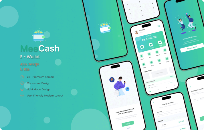
“MeeCash” is a user interface (UI) design that blends Consistent Design, Light Mode Design, and User-Friendly Modern Layout elements to deliver an engaging and functional user experience. Carefully crafted, the application ensures consistency, readability, and ease of use across all aspects.
Consistent Design serves as the cornerstone of “MeeCash” development. Every UI element, from colors and typography to icons and navigation, is chosen with high consistency to create a harmonious and professional appearance. This consistency not only strengthens the “MeeCash” brand identity but also makes it easier for users to interact with the application, as they become familiar with the consistent design patterns.
Light Mode Design is the perfect choice for “MeeCash” to offer users a comfortable and soothing experience. With a bright and light color palette, the application creates a luminous and easily navigable environment for users. The light mode also enhances content readability, ensuring that information presented can be clearly understood by users without causing eye strain.
User-Friendly Modern Layout takes center stage in “MeeCash” design. This modern layout is designed to present information in an intuitive and efficient manner for modern users. By prioritizing user experience design principles, the application offers easy-to-understand navigation, intuitive controls, and responsive layouts. This not only improves user efficiency in using the application but also creates a pleasant and satisfying experience.
Overall, “MeeCash” is a user interface design that combines elements of consistency, readability, and ease of use to create a captivating and effective user experience. With a design aligned with current trends and user needs, the application is expected to provide significant value to its users.

